Migraine Buddy Redesign
A redesign of a migraine tracking mobile app to be more intuitive, user friendly, and accessible
The challenge
Migraine Buddy offers more features than many other migraine tracking apps—but for many users, the app is overwhelming.
Some have abandoned Migraine Buddy for another app or a paper journal because it’s too hard to find what they’re looking for. This is an important consideration, because the app is meant to be used in the middle of a migraine, when users are in pain.
With this in mind, how can we make Migraine Buddy more user friendly and accessible, so that users don’t abandon the app?
Role
User Research
UX Design
Prototyping and Testing
User Interface Design
Interaction Design
Timeline
24 weeks
Context
This project was part of my work for my Master’s program in UX Design.
Tools
Airtable, Figma, InVision, Miro
Discovery research
After interviewing several Migraine Buddy users about their experiences with the app, these were the core pain points I found users had:
Overwhelming UI, features have become crowded and busy. It’s become harder to find what they are looking for.
Frustrating micro interactions. The design of the interactions for things like choosing the time a headache began, the amount of medication taken, and symptoms is frustrating to maneuver, unnecessarily cumbersome, and time-consuming.
Not inclusive of all migraine experiences. There are few opportunities to track information outside of a migraine episode or attack, and no ability to track pain level fluctuations, among other limitations.
Current interface
Competitive analysis
After interviewing users and reading Migraine Buddy reviews in the App Store and Google Play Store, I decided to look at what else was in the market that people were using. I reviewed 5 direct competitors and 3 indirect competitors.
Design process
I had an idea of what users’ biggest challenges were when using Migraine Buddy, and what other products existed in the market, so I started mapping out how different users interact with the app and brainstorming potential design solutions to these problems.
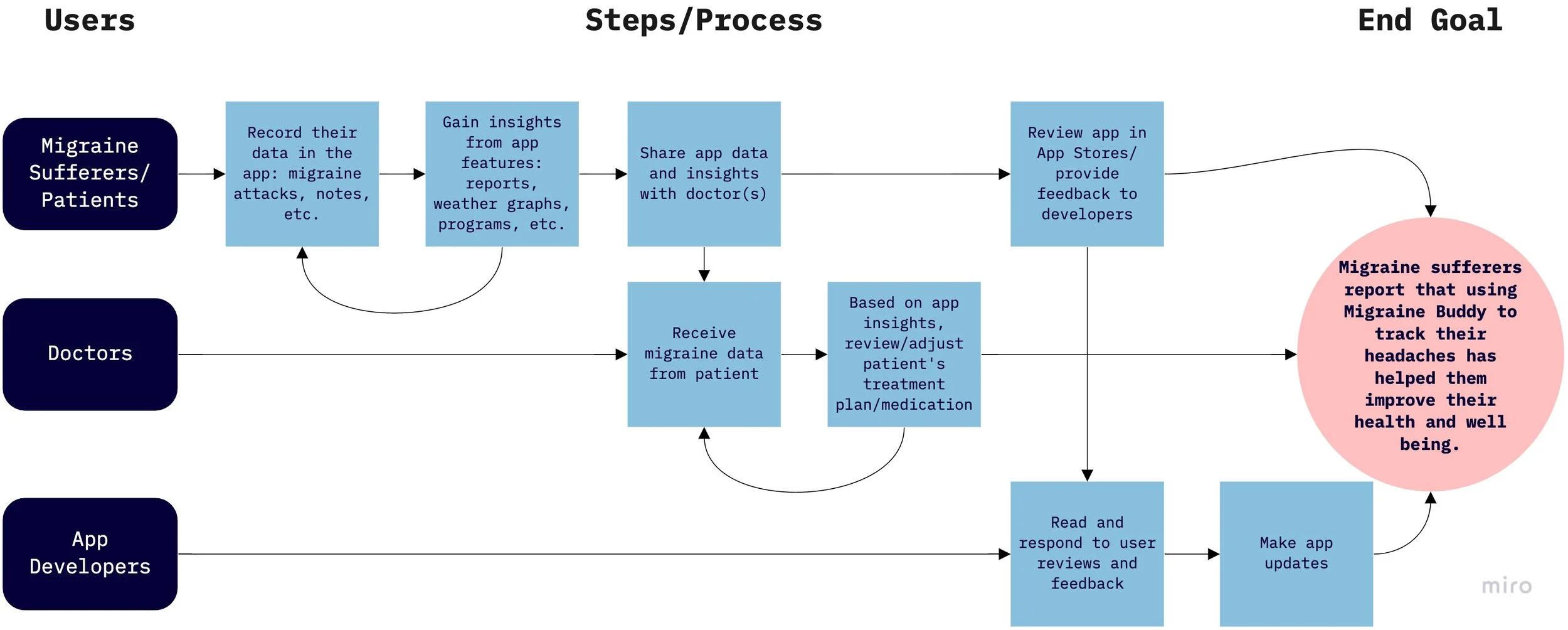
This map shows all the groups of people that interact with the app, directly or indirectly. This was where I refined the goal: for Migraine Buddy to help migraine sufferers feel better.
I did some Crazy 8 sketches to explore a myriad of potential design solutions based on user feedback about their core challenges.
I refined some of the Crazy 8 ideas here, focusing on categorizing and presenting different types of content in more user friendly ways.
Design goals
I now had a good idea of design solutions I wanted to prototype:
Information architecture: redesign user flows to be intuitive and easy to navigate
Migraine recording feature: simplify to make it user friendly, while still being comprehensive
User interface: redesign to reflect the simplicity I was aiming for in the redesigned user flows and features
Designing new user flows
Since addressing the information architecture was one of my design goals, I began with mapping out two user flows: the first was the current user flow of the app as it was.
Current/as-is user flow
Once I mapped out the flow of the app, it was easy to see the problems users were referring to when they said things were hard to find in Migraine Buddy. For example:
Features are not easily identifiable. For example, a user wouldn’t know that “Discover” is where they’d find educational resources, or “Features” is where they’d find data and reports on their headaches.
Most pages don’t lead back to one main screen. The current flow has multiple landing pages and levels of navigation, which makes it difficult for users to self-orient and find what they’re looking for.
Redesigned user flow
Using the data from my user research and the ideas from my sketches, I redesigned a new user flow.
This employs hierarchical navigation, with everything leading back to the home screen. The home screen houses 4 main functions, which were determined to be the most used by app users: headache recording, weather and pressure forecasting, reporting on headache data, and resources for living with migraine.
User journey
The storyboard shows a user going through the main features of the app over the course of a few days, based on the current version of the app.
It highlights several victories and pain points for users:
She’s able to pull reports of her data, but entering that data is a challenge.
When she is in too much pain to record her migraine, she finds makeshift solutions to make it work for her.
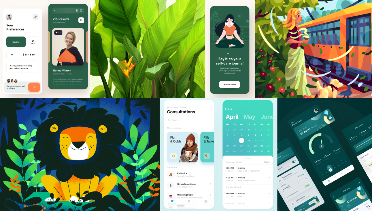
Inspiration for visual design
I was inspired by shades of green because of its proven therapeutic properties in treating migraines. Green light, for example, is known to trigger migraines less than other colored lights.
Knowing that these light properties wouldn’t translate to a screen, I wanted to use a cool color and darker theme to encourage a sense of calm. The visual design went through several iterations before I arrived at the final designs.
Mood board inspiration for the color theme
Brand assets
Due to the pandemic, I conducted user tests on Zoom (photo used with user permission). The screenshots here show an older version of the prototype.
Testing with users
I conducted a hybrid of task and narrative analysis and observational tests with 6 participants. I was interested in learning if:
The user flow I designed is intuitive to navigate so users can manage their migraines
The redesigned reports screens are organized in a way that enables users to view their data accurately
The redesigned microinteractions (like the symptom selectors, report generating criteria, and start/end time selectors) are user friendly and intuitive
I asked participants to use the prototype to:
Record a migraine event
Locate the Migraine Log
Generate a custom report
Modifying the prototype
After user testing, I noticed that there were several tangible things I could change in the prototype that would immediately improve the user’s experience.
I focused on improving the migraine recording experience, creating a better user profile, and making some modifications to the reporting screens.
Home screen and quick record function
The redesigned home screen establishes consistent navigation and places key features front and center (current screen on left). Additionally, users wanted to be able to start a headache record with 1 click and return to it later, without needing to fill out any information in the moment.
Headache recording
The redesigned headache recording screens consolidate 17 symptom tracking categories into 7. Users can choose where to begin tracking symptoms and skip steps if they choose, rather than following a prescribed flow (current screen on left).
User profile
I built out a Profile page incorporating content suggestions from users (current screen on left).
My headache log
The headache log is a chronological list of all of a user’s migraines (current screen on left). I added the ability to sort by date, migraine type, pain level, or duration. Users can also download custom reports. This page was relocated from the “Record an Event” flow to “Reports” based on user feedback.
Reflections 🧠
What I’d do differently
I have a much greater understanding of the capabilities of prototyping programs now, so if I were to redo or continue with a different scope, I would make lower fidelity wireframes and run tree tests with users before wireframing/prototyping.
Revisiting UI design
This was my first design project, so the visual design went through multiple iterations from the beginning of the project to the end. I learned a considerable amount about accessible design and best practices for mobile interface design that I was able to apply to this project and take into future projects.
Early design ideas & pivoting after user research
One of my initial ideas was to explore the ability for doctors to utilize user-generated data in migraine research. I hypothesized that this data could be used to advance migraine research. After receiving lukewarm interest from the headache specialist I interviewed in both using the app and in the potential of using user data in research, I decided to shift my design focus towards current Migraine Buddy users, where I could make the most tangible impact.
If I continue this project, I’d like to research, design and test for the other two ideas I had: improved micro interactions and more inclusive migraine recording features. I might want to interview some more neurologists and headache specialists and explore what some new design solutions could look like.


